


Before you even think about fonts or colors, you have to get the technical stuff right. Think of it like a blueprint for a house—your banner's dimensions are the foundation. Get this wrong, and your masterpiece will look broken and unprofessional to a huge chunk of your audience.
The goal isn't just to make something that looks good in your design software. It’s about creating a consistent, polished first impression, whether someone finds you on their giant smart TV or their tiny phone screen. A beautifully designed banner that gets awkwardly cropped on mobile can scream "amateur," and that's the last thing you want.
Mastering YouTube Banner Size and Safe Zones
YouTube's banner space is a bit weird. It's a huge, wide canvas that has to shrink and adapt to dozens of different screen sizes, which makes designing for it tricky.
The first number you need to know is 2560 x 1440 pixels. This is the full-size image, the one that viewers will see if they're watching on a TV. But almost no one else will see this full version. That's where the "safe zone" comes in, and it's the most important concept to grasp.
The All-Important "Safe Zone"
The safe zone is a small, central slice of that massive canvas. This is the only area that is guaranteed to be visible on every single device.
The safe zone is your prime real estate. It’s where your logo, channel name, tagline, and any critical calls-to-action absolutely must live. If it’s not in the safe zone, you have to assume most people won't see it.
Ignoring this is easily the biggest mistake new YouTubers make. They’ll design a gorgeous banner with their social media links on the far left and an upload schedule on the far right. It looks perfect on their big desktop monitor. Then they check it on their phone, and all that vital information is just… gone. Cropped right out of existence.
This diagram breaks down how that big image gets chopped up for different views.
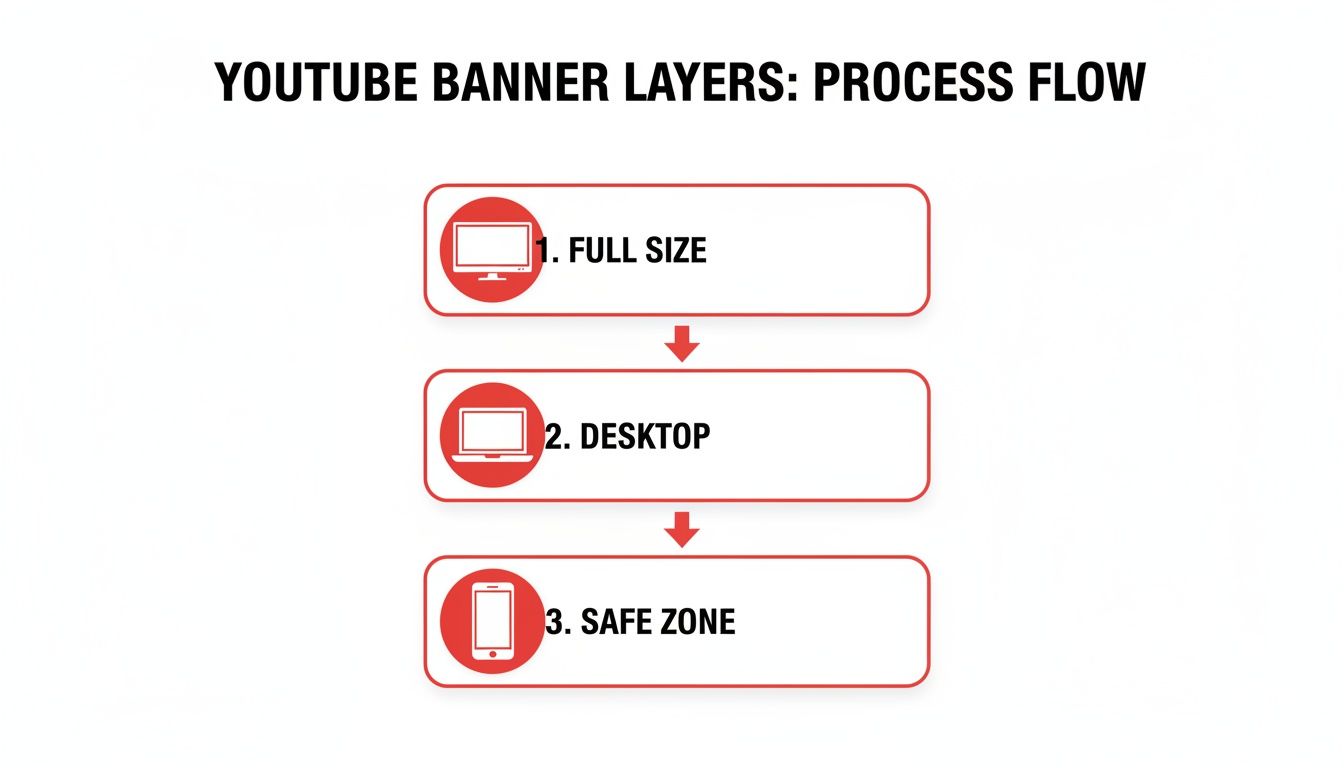
As you can see, only that little box in the middle is a sure thing. Think of the rest of the banner as background decoration—it should look good and match your branding, but it can't contain anything essential.
While the context is physical media, the core principles in guides on pull up banner design and sizing are surprisingly relevant here. The lesson is universal: focus your most important message in the area everyone will see.
YouTube Banner Dimensions Cheat Sheet
To make it easy, here are the exact numbers you need to build your banner around. I recommend keeping this handy or even using a template with these guides already built-in.
| Specification | Dimension/Requirement |
|---|---|
| Full Banner (TVs) | 2560 x 1440 pixels |
| Desktop Max | 2560 x 423 pixels |
| Tablet Display | 1855 x 423 pixels |
| Safe Zone (All Devices) | 1235 x 338 pixels |
| Minimum Upload Size | 2048 x 1152 pixels |
| File Size Limit | Under 6 MB |
Stick to these guidelines, and you'll have a banner that looks sharp and professional for every single viewer. This is a foundational step, whether you're building a personal brand or running a faceless channel.
Planning Your Banner for Brand Impact
Before you even think about opening a design tool, let's talk strategy. The most important work you'll do for your YouTube banner happens before you pick a single color or font. A truly great banner isn't just a pretty picture; it's your channel's digital billboard. It has a few precious seconds to tell new visitors exactly who you are, what you do, and why they should bother sticking around.
If you skip this planning phase, you'll end up with a banner that might look nice but does absolutely nothing for your channel's growth. The goal here is instant clarity. Someone landing on your channel for the first time should get the gist of it without having to read a single video title. This is your first handshake, your elevator pitch, and your best chance to make a real connection.
Nail Down Your Channel's Identity
First things first, ask yourself a simple question: What is my channel about?
Try to boil the answer down to a short, punchy tagline. This isn't just a mental exercise—this line might literally be the most important text in your banner.
- Gaming channel? Think "Daily Elden Ring Guides & Lore."
- Cooking channel? How about "Simple Vegan Recipes for Busy People."
- Business channel? Try "Helping SaaS Founders Scale to $1M."
This single phrase becomes the north star for your entire design. Every color, font, and image you choose from here on out should echo and amplify this core idea. A high-energy fitness channel needs a dynamic, motivating design. On the flip side, a channel focused on meditation should feel calm, clean, and uncluttered.
Your banner’s main job is to communicate your value proposition. It has to answer a visitor's silent question: "What's in it for me?"
This kind of clarity is a game-changer, especially if you're just starting out or have invested in a pre-built channel. A strong brand presence is what helps a monetized YouTube channel build on its foundation, earning viewer trust and encouraging real growth from day one.
Choosing Your Core Design Elements
Once you know what you want to say, you can figure out how to say it visually. Consistency is everything here. These elements will become your brand's signature across YouTube and all your other social media platforms.
Color Palette
Colors aren't just decorative; they trigger emotions. In fact, research shows that up to 90% of snap judgments about products are based on color alone.
- Blues and Greens: These often feel trustworthy, calm, and professional. They work wonders for educational, tech, or wellness channels.
- Reds and Oranges: These scream excitement, energy, and urgency. Perfect for entertainment, vlogging, or high-drama gaming content.
- Black and White: This combination signals sophistication and minimalism. It’s a great fit for luxury brands, design tutorials, or high-end tech reviews.
My advice? Stick to a simple palette of two or three complementary colors. Anything more can start to look chaotic and unprofessional.
Typography
The fonts you pick say just as much as the words themselves. You're looking for a balance between personality and pure, simple readability.
- Primary Font: This is for your channel name or that killer tagline we talked about. It can be bold and full of personality—this is where your brand’s character shines through.
- Secondary Font: Use this for smaller details, like your upload schedule or social media handles. It absolutely must be easy to read, even on a tiny phone screen. A clean sans-serif font like Montserrat or Lato is almost always a safe bet.
What Information Should Actually Be On the Banner?
Beyond the visuals, your banner needs to be functional. It’s a tool for turning casual viewers into dedicated subscribers. While you want to keep the text minimal to avoid clutter, a few key pieces of information can provide a ton of value.
- Your Value Proposition: We've covered this, but it's the most critical piece. What do you do? Who is it for?
- Upload Schedule: Something as simple as "New Videos Every Tuesday & Friday" sets clear expectations and gives people a reason to come back for more.
- Social Media Handles: Add icons and your usernames for the platforms you use most. This helps you build a community that extends beyond YouTube.
- A High-Quality Image: This could be a professional headshot, a clean logo (especially for faceless channels), or a sharp image that sums up your niche—think a stunning travel photo or a dynamic shot from a game you feature.
By taking the time to plan these elements before you start dragging and dropping shapes, you set yourself up for success. You’ll create a banner that isn't just a pretty header, but a hard-working asset that actively builds your brand and grows your audience.
Alright, you’ve got your branding blueprint and you know what message you want to send. Now for the fun part: actually making the banner. This is where your ideas about colors, fonts, and what your channel offers become a real, tangible design.
The tool you pick matters. It can make the process a breeze or a bit of a headache, but the good news is there are great options out there for everyone, no matter your skill level or budget.
Whether you're a total beginner who just wants something that looks good fast, or a seasoned pro who wants to control every last pixel, there's a tool for you. We'll walk through three of the heavy hitters—Canva, Adobe Photoshop, and Figma—so you can find the right one for the job.
Canva: Your Fast-Track to a Pro-Level Banner
Honestly, for most creators—especially if you're just starting out or running a faceless channel—Canva is probably the way to go. It’s built from the ground up to be simple and quick, cutting out the steep learning curve you get with more powerful design software.
The best thing about Canva is its giant library of pre-made YouTube banner templates. When you start with one, Canva automatically sets up your canvas at the perfect 2560 x 1440 pixel size. Even better, most templates have the safe areas already marked out, so you don't have to guess where your important stuff needs to go. It just works.
A quick workflow in Canva looks something like this:
- Find a Template: Just browse their library and find a layout that fits your channel's vibe. Don't get hung up on the colors or photos—you can change all that. Focus on the structure.
- Plug in Your Branding: This is easy. Swap out the template's colors for your own. Upload your logo and drop it right in the middle of that safe zone.
- Edit the Text: Replace the placeholder text with your channel name and your tagline. Play around with Canva’s fonts until you find something that feels right.
- Add Your Images: Get rid of the stock photos and use your own. This could be a picture of you, your products, or just a cool graphic that represents your niche.
Thanks to its drag-and-drop editor, you can pull together a really polished banner in less than 30 minutes, even if you’ve never designed anything before.
Adobe Photoshop: For When You Need Total Control
If you're someone who needs more firepower or you already know your way around design software, Adobe Photoshop is the undisputed king. It gives you absolute control over every single detail.
While Canva is all about speed, Photoshop is where you go for detailed, completely custom work. For banner design, its best features are the layers and guides. You can set up pixel-perfect guides to mark out the 1235 x 338 pixel safe zone, making sure your logo and text are positioned with total accuracy.
My Go-To Method: I always start with a full 2560 x 1440 px canvas. Then, I draw a 1235 x 338 px rectangle right in the center and use its edges to create my guides. After that, I just delete the rectangle, and I'm left with a perfect template for the safe zone.
Photoshop also unlocks some seriously cool creative effects:
- Advanced Photo Editing: You can blend images together seamlessly, fix lighting, and apply professional-level color grading.
- Custom Graphics: Want to create your own shapes or textures from scratch? No problem. You won’t be limited to what's in a template library.
- Layer Masks: These are a lifesaver. They let you edit non-destructively, so you can experiment freely and easily tweak things later.
Yes, Photoshop has a learning curve and requires a subscription. But for creators who are serious about building a one-of-a-kind brand, it’s worth every penny. For more tips on branding and design, check out the articles on our https://monetizedprofiles.com/blog.
Figma: The Modern, Collaborative Option
Figma is an interesting one. It sits somewhere between Canva's simplicity and Photoshop's complexity. It was built for designing websites and apps, but a lot of creators now use it for its powerful, web-based workflow.
The key difference here is that Figma is vector-based, while Photoshop is pixel-based (raster). This means anything you create in Figma—like a logo or an icon—can be scaled up or down to any size without losing a single bit of quality. That's a huge plus for keeping your brand looking sharp across all platforms.
Figma also shines when it comes to teamwork. You can send a link to your design to get feedback, and your friends or colleagues can drop comments right onto the design itself. It has a very generous free plan, making its best features available to everyone. If you’re comfortable with design tools but want something more modern and collaborative, Figma is a fantastic choice for making a crisp, scalable YouTube banner.
You’ve poured everything into designing the perfect banner. The colors are just right, the text is sharp, and your channel’s value prop is front and center. But all that work can go down the drain if you mess up the final step: the upload.
This is a classic stumbling block. So many creators design a masterpiece, only to see it look blurry or pixelated once it’s live on their channel. The secret to avoiding this is all in how you save and upload the file.
Choosing the Right File Format
When you’re ready to export your design, you'll see a few options. For a YouTube banner that relies on sharp text, clean logos, and crisp graphic elements, the PNG format is almost always the right call.
Why PNG? It uses what's called "lossless" compression. In simple terms, it makes the file smaller without trashing the image quality. This keeps your text readable and the edges of your graphics looking clean—exactly what you need for a professional-looking banner.
JPG is the other common format, and while it's fantastic for photos, its "lossy" compression can create fuzzy little artifacts around text and solid colors. It’s a subtle difference, but it can make your banner look cheap.
My Advice: Stick with PNG to keep your graphics and text looking sharp. The only time to even consider JPG is if your banner is a pure photograph and you’re having a hard time getting the file size down.
Keeping Your File Size in Check
Speaking of file size, YouTube is pretty strict here: your banner has to be under 6 MB. This usually isn't a problem, but if you've created a really detailed, high-resolution PNG, you might find yourself over the limit.
If your file is too big, don't just default to saving it as a low-quality JPG. That’s a recipe for a fuzzy banner. Instead, use an online image compression tool. There are plenty of free ones that will shrink your PNG’s file size without any noticeable loss in quality. It’s a quick extra step that preserves all the hard work you put into the design.
The Upload and Preview: Your Final Quality Check
Alright, you've got your optimized PNG file ready to go. Now it’s time to get it on your channel. The upload itself is easy, but the preview stage is where you need to pay close attention. Do not skip this.
Here’s the process on a desktop:
- Head over to your channel and click the “Customize Channel” button. This will take you into the YouTube Studio.
- From there, click on the “Branding” tab.
- Look for the “Banner image” section, click “CHANGE,” and upload your file.
Now for the moment of truth. YouTube will show you exactly how your banner will look on three different screens: TV, Desktop, and Mobile.
- TV: The full 2560 x 1440 px image.
- Desktop: A wide, panoramic crop.
- Mobile & All Devices: The small, central "safe area."
Pay the most attention to that mobile view. Is your logo perfectly centered? Can you read all the text? Is anything important getting cut off? This is your final chance to catch any mistakes before the world sees them. Since most viewers will be on their phones, getting this right is non-negotiable.
If it all looks good, hit “DONE” and then “PUBLISH.” Just like that, your awesome new banner is live for everyone to see.
Common Banner Mistakes and How to Fix Them
Creating a great YouTube banner is about more than just picking a cool font. I’ve seen countless channels, even those with great content, make small, avoidable mistakes that instantly cheapen their look. Let’s walk through the most common pitfalls and, more importantly, how you can sidestep them to make a killer first impression.
These simple errors can hurt your credibility before anyone even clicks on a video. The good news? They're all quick wins that can have a huge impact on how viewers see your brand.
The Blurry, Low-Resolution Image
This is probably the most frequent mistake I see, and it's a dead giveaway of an amateur channel. A blurry or pixelated banner just screams a lack of attention to detail. This usually happens when someone finds a small image they like and tries to stretch it to fit the massive 2560 x 1440 pixel banner dimensions.
The fix is straightforward: always start with high-resolution images. When you're grabbing a stock photo or a background graphic, make sure it's at least 2560 pixels wide. Most stock photo sites let you download different sizes, so just grab the largest one they offer.
Here's a pro tip to live by: You can always make a big image smaller without losing quality, but you can never make a small image bigger without it looking like a mess. A crisp, clear image is absolutely non-negotiable.
Overloading the Banner with Text
Your banner is a billboard, not a book. So many new creators feel the urge to cram everything into that small space—their full name, a long tagline, their upload schedule, every social media handle they own, and a plea to subscribe. The result is just visual noise.
When there's too much going on, viewers get overwhelmed and their eyes just glaze over. They won't read any of it, and your most important message gets completely lost.
Instead, you need to be ruthless with your editing. Ask yourself: what are the one or two most important things a new visitor needs to know? It's usually your channel name and a short, punchy tagline (like "Daily Python Tutorials"). Everything else, like your social media, belongs in YouTube's dedicated links section.
Ignoring Color Contrast and Readability
Having a beautiful color palette is pointless if no one can read what it says. This is a classic design flub—picking a text color that’s too similar to the background. Think light gray text on a white background or dark blue text on a black one. It’s a recipe for an unreadable mess.
This isn't just bad design; it's an accessibility problem. You could be alienating potential subscribers who have visual impairments without even realizing it.
The solution is to aim for high contrast. The easiest way to do this is to put light-colored text on a dark background, or vice versa. If you're unsure, use a free online contrast checker. You’re aiming for a contrast ratio of at least 4.5 to 1 to ensure your text is clear and legible for everyone.
Designing Without the Safe Zone
I see this one all the time. A creator designs a banner that looks absolutely perfect on their big desktop monitor, but they forget that most people will see it on a tiny phone screen. The result? The channel name and logo get awkwardly chopped off.
Your branding efforts are completely wasted if your channel name isn't even visible. Your banner just becomes a generic background image with no real purpose.
You absolutely have to design with the "safe zone" in mind. This is the central 1235 x 338 pixel area that's visible on all devices. Every decent design tool, from Canva to Photoshop, lets you use templates or guides to mark this critical space. Keep every essential element—your logo, channel name, and tagline—smack in the middle of that zone. That's the only way to guarantee a professional, consistent look on every single device.
Frequently Asked Questions
Even with the best guide in hand, a few questions always pop up when you're in the middle of creating a YouTube banner. Getting these details right can be the difference between a channel that looks amateur and one that looks like a pro runs it.
I've put together some quick, no-fluff answers to the questions I hear most often from creators. Let's clear up the confusion so you can get your channel's branding dialed in.
Where Can I Find Free Images and Fonts?
You definitely don't need a big budget for professional-looking assets. For amazing, royalty-free images, my go-to sites are Unsplash, Pexels, and Pixabay. They're packed with millions of high-quality photos you can use for free, even commercially.
When it comes to fonts, Google Fonts is an absolute goldmine. It has a massive, open-source library that works with pretty much any design tool out there. You can find the perfect font to match your vibe without spending a single dollar.
How Often Should I Update My Banner?
There isn't a hard-and-fast rule here, but I generally recommend refreshing your banner whenever your channel's branding or content focus changes.
- Seasonal Flair: A holiday-themed banner is a simple way to show your channel is current and active.
- Celebrating Milestones: Did you just hit 100,000 subscribers? That's the perfect excuse for a new banner to celebrate with your audience.
- New Content Direction: If you're pivoting from, say, general tech reviews to focusing only on smartphones, your banner needs to reflect that shift immediately to attract the right viewers.
Treat your banner as a living part of your channel, not something you just set once and forget. A small refresh every 6-12 months is a great way to keep things looking current.
Does a Banner Really Impact Subscriber Growth?
It absolutely does, though maybe not in the way you think. The banner itself doesn't have a "subscribe" button, but it's one of the first things a potential subscriber sees, and it's all about first impressions.
A sharp, well-designed banner instantly tells a new visitor you’re serious about your content. It builds credibility and quickly communicates what your channel is all about, making it far more likely that the right people will stick around, watch your videos, and hit subscribe.
On the flip side, a confusing or sloppy banner can make people click away before they even watch a single video. This is especially true for creators who start with an established account; maintaining a professional look with a strong banner is critical for preserving the value of an aged YouTube channel and its built-in authority.
Should I Add Social Media Buttons to My Banner?
You could add social media icons to your banner design, but YouTube has a much better, built-in solution.
Head over to the "Customization" tab in your YouTube Studio. In the "Basic Info" section, you'll find an option to add clickable links that appear right on top of your banner in the bottom-right corner.
Using this feature is way more effective. It keeps your design clean and gives your viewers a direct, functional way to find you on other platforms.
Ready to take your content career to the next level without the wait? MonetizedProfiles offers fully approved, ready-to-earn YouTube accounts, so you can start generating ad revenue from your very first video. Skip the grind and focus on what you do best—creating amazing content.
Visit us at https://monetizedprofiles.com to find the perfect monetized channel for your niche.


